Game Developer & Student


DH2002:
Assignment 2
Table Of Contents:
-
Introduction
-
Background
-
Methodology
-
Data measurement
-
data analysis
-
-
Findings
-
Daily water Intake
-
Caffeine vs sleep
-
social media vs step count
-
energy over time
-
-
Conclusion
-
bibliography
Introduction:
During week two of our second semester, we were tasked with collecting data about ourselves. We were granted the freedom to gather the data in any form we deemed fit as well as on any topic we wished to explore, so long as it was centered around ourselves. The project itself would not be due until the end of April; however, it was important that we began collecting our data as soon as possible to gain a dataset large enough, to uncover findings about ourselves that would be hard without proper visualization.
In my own case, I chose to track how my daily habits affected my sleep patterns. As a full time, third level student, it is far too common that I experience a fragmented sleep schedule as I balance college work, a social life and volunteer work; as you can imagine this leads to less sleep than I hope for.
For my data collection, I used a combination of three separate tools. Firstly, my smartwatch was used to measure both sleep time and steps taken. I used a habit tracking app(1) throughout my day to track my caffeine intake; time spent on social media and water drank. Lastly, I made it a habit to transfer this data to an excel file at the end of every week as it was the only way I could create a CSV file that could be read in python.
2. Background
As mentioned previously, I am a full time third level student. I commute roughly forty-five minutes each morning to college from my hometown. I eat three meals a day and often drink either black coffee or green tea during my commute. I am quite active as I exercise four times a week on average: running three times and playing football once. I also volunteer on Tuesday evenings as a scout leader and Saturday mornings as a coding mentor for younger kids. In my spare time, I develop video games(2) and draw digital assets that are sold online.
3. Methodology
My methodology is divided into how I measured my data and how I analyzed it.
3.1 Data Measurement
Before presenting my findings as well as discussing the steps taken to get there, I would also like to share how the data is measured.
Most of the water that I intake is from a reusable water bottle that is 500ml in size or else is from a 250ml glass.
The amount of sleep I had gotten from the previous night was collected as a decimal number and rounded to the nearest half.
I rated my energy from a scale of one to ten, with one being the lowest each evening.
The caffeine content of drinks I consumed were measured in line with the Mayo Clinic(3) and rounded to the nearest ten for simplicity (fig 1.1).
Figure 1.1: Table showing the amount of caffeine per beverage, according to the Mayo Clinic.
3.2 Data Analysis
Before visualizing my data, I had to decide what it is I wanted to find. What story did I want to tell? Firstly, I uploaded my CSV to GitHub as a public repository and opened it in google collab using the Pandas library(4), a data analysis tool.
I began by studying the data types of each column, in order to get a sense of how the data can be organized and manipulated (fig 2.1).
Figure 2.1: A list of all column titles & variable types used in my dataset.
Then I noted a handful of key question that I could explore:
-
What is my average water intake per day? What does it reveal?
-
Does my caffeine intake affect how well I sleep?
-
Is there a correlation between steps taken and time spent on social media? Could they balance each other out?
-
Did my energy ratings stay consistent during each month
-
Were there specific dates that give outliers & what event could have caused them?
Using these questions as guidelines, I began to use the data that I had accumulated over the past three months to convert my life into quantifiable and perceivable data that could be used to describe my life; even to someone that might not have ever met me before. At the end of the day, we are creatures of habit, and I hoped that idea with my data.
4. Findings
These are my findings based on the data accumulated, manipulated through python and expressed through the pandas library.
4.1 Daily Water Intake
As mentioned previously, I aim to exercise four times a week and so would estimate that my water intake is highest on these days. Using python, I grouped my data based on the name of the day and found the average water consumed from each one across the entire dataset (fig 3.1). From the graph below (fig 3.2), can you deduce which days these are?
Figure 3.1: Code written to group and plot my water intake based on the day of the week.
Figure 3.2: A graph showing my water intake based on day of the week.
Whilst my water intake is generally high throughout the week, it peaks on a Monday, closely followed by Friday and Tuesday. My workout plan is as follows: I run on a Monday, Wednesday and Sunday, I play football every Friday; which is reflected in the graph. Interestingly, Tuesday is the third highest, which may be because of my volunteer work, as I spend a lot of time talking as I teach as a scout leader.
My water intake being the lowest on a Saturday may be due to a lower amount of physical activity. Despite volunteering on a Saturday morning, it is much more sedentary as I sit down whilst teaching kids to code, as opposed to moving around during scouts.
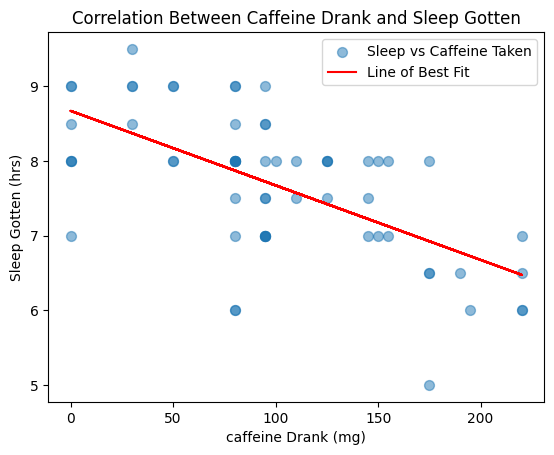
4.2 Caffeine Vs Sleep
To determine a correlation between these two variables, I plotted a scatter graph as well as a line of best fit to determine if there was a relationship between them using matplotlib(5) (fig 3.3).
Figure 3.3: Code used to create a scatter plot, calculate and show a line of best fit.
According to the Mayo Clinic(6), the maximum intake of caffeine for adults is roughly 400mg, depending on gender, weight etc. Before examining the graph (fig 3.4), I know that my daily intake, rarely comes close to this figure; therefore, if caffeine and my sleep patterns do have a correlation, it may be important for me to limit my intake to earlier in the day, instead of the volume.
Figure 3.4: A graph showing the correlation between my caffeine intake and the amount of sleep I got because of it.
As seen from the graph, my caffeine intake across the three months peaked at just over 200mg, showing the volume may not be the issue. The correlation between the two variables is somewhat strong and negative. From this information, I believe that the caffeine I consume, from a range of drinks, does affect my sleep, however the timing of which I consume it may impact me more than how much of it I consume.
4.3 Social Media vs Step Count
To plot this graph, I also used a scatter plot, this time using three separate variables: “Step Count” and “Time on Social Media” influenced each point’s position, “Energy Rating” determined each point’s color (fig 3.5).
Figure 3.5: Code used to generate a scatter plot, calculate and plot line of best fit for “Steps Taken” vs “Time on Social Media”.
For this graph (fig 3.6), I was interested to see if these variables not only had a correlation but also cancelled each other out (i.e. a high step count would mean less time on social media). As well as this, I also added my “Energy Rating” variable to see if either of these influenced how I felt at the end of the day.
Figure 3.6: Scatter plot of time on social media, steps taken and energy rating.
As you can see, there is a strong negative correlation between both “Steps Taken” and “Time on Social Media”. The energy rating variable also decreases alongside these variables; however, it is much more likely that I feel tired due to a higher step count rather than time spent on social media.
4.4 Energy Ratings Over Time
Throughout both February and March, I wanted to test if my daily energy ratings stayed consistent between each month, as well as identify any outliers and pinpoint what events might have caused them.
To do so, I divided my dataset by months (which were stored as variables) and plotted each one individually on the graph (fig 3.7)
Figure 3.7: Code used to split data by month and plot it as a scatter plot.
Generally, my energy ratings remained consistent between both February and March (fig 3.8); besides a couple of harsh drops in March. My January data was collected from the twenty-eight onwards, so it does not have enough data to fairly represent it.
These two harsh drops are because of attending two different concerts. Lack of sleep paired with a high step count attributed to a low energy level the following day, leading to such outliers.
Figure 3.8: Line plot of Energy Levels across January, February and March.
5. Conclusion
Overall, I am quite happy with the conclusions that I have reached having conducted this research myself. In hindsight, certain aspects such as my caffeine intake should have been apparent, but with such busy days, it was not something I had thought about previously, and having been able to visualize its effects, I can alter my consumption habits accordingly.
Building on this, I found it interesting to compare my self-rated energy levels across February and March as I could see that there was a consistency to it, neither month deviated strongly from each other (outside of obvious outliers). This proves that I kept my ratings fair across the dataset, avoiding bias on certain days. Furthermore, it proves that I am quite habit-oriented, something that I had wanted to prove from the start of this assignment.
If I were to re-do this assignment, I would reconsider my data gathering techniques. Transferring from my mobile apps to an excel spread became tedious and easy to get wrong, which could lead to incorrect data. I also think that columns such as “Energy Rating” could be split into two distinct columns, once measured in the afternoon and one in the evening, to get even more accurate data.
6. Bibliography
1. https://play.google.com/store/apps/details?id=com.habitnow&hl=en_IE&pli=1
3. https://www.mayoclinic.org/healthy-lifestyle/nutrition-and-healthy-eating/in-depth/caffeine
6. https://www.mayoclinic.org/healthy-lifestyle/nutrition-and-healthy-eating/in-depth/caffeine/art-20045678